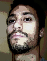
I started with an older photo that I had taken of myself, probably to document the growth of my facial hair or depression.
 I used PAINT.NET to process the image, using posterization and some filters to simplify the colours into basic regions.
I printed this off and then divided the page up into a grid with light blue pencil. I prepared my canvas by covering it in a few layers of white gesso. I then divided my canvas up into an equivalent grid and copied the lines on the printed page over to the canvas by eye.
My thinking was that by carefully blocking out the shapes and major colour groups I would get the proportions and lighting more or less correct using a sort of paint-by-numbers approach. Basically, painting for non-painters.
In hindsight I got the perspective (and therefore the proportions) wrong going from the photo to the sketch. On the whole I don't think it went too badly, but should definitely spend more time upfront in the sketching. One thing to note is that throughout this post the perspective/proportions may seem to jump around the place, that really is just the work of poor camera shots. From sketch to final painting I didn't mess up the proportions any further.
I started by filling in the blacks.
Next I filled in the next darkest colours.
Proceeding in this manner I started to see it pulling together.
At this point the skin has an almost clay or mud-like quality to me. It seems flat and earthy, and reminds me of Ben-Hur.
With the eyes blocked in without any shadowing, there's a creepy Uncanny Valley effect where the eyes seem out of place with the rest of the head.
A few simple strokes of shading in the sclera does a lot to bring the eyes in line with the rest of the head.
For the background I felt I wanted a sort of warm yet rustic yellow and tried this out with a layer.
I brought some more mid-tones to the lips, scaling back the highlights.
I layered the background in thicker and somewhat darker with uneven dabs to add texture.
At this point everything was filled in, but there was a still a lot of contrast between colour regions and the highlights looked over-exposed in comparison to the mid-tones. The other problem is that the blue pencil marks are still visible beneath the paint, necessitating another layer.
Another pass where I adjusted the colouring and added more gradations between colour zones, trying to confer a somewhat more naturalistic look without losing a sense of depth.
The final picture.


